
Why Stylised QR Codes Fail to Scan (And How to Fix It)
A stylised QR code can look sharper, more premium, and more on-brand than a plain black square — but that does not mean it will scan reliably in the real world. The problem usually is not the idea of styling the code. The problem is that the styling has pushed the design beyond what phone cameras can detect easily. Contrast becomes too soft, the quiet zone disappears, the logo blocks too much data, or the code is altered in ways that make detection slower and less consistent.
For businesses in London, Greater London, and across the United Kingdom, that is not a small design flaw. It is a conversion problem. When a QR code on a café counter, event poster, property board, retail window, menu, product label, or review card fails to scan, the business loses engagement, wastes print, and breaks the link between the physical world and the measurable digital action that should have followed.
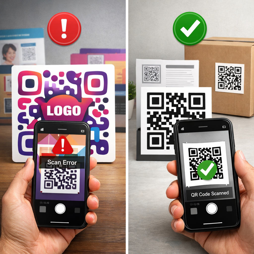
💡 Short answer
Stylised QR codes fail to scan when design choices interfere with the code’s machine-readable structure. A QR code is not just a visual brand asset. It is a detection pattern. If you weaken contrast, remove the clear border, over-style the modules, crop too tightly, print too small, or place the code on reflective or cluttered surfaces, scanners struggle to recognise it. In practical terms, the code may look better to people but perform worse for cameras.
Quick facts: why stylised QR codes stop scanning
- Core issue: a QR code is a machine-readable pattern first and a design element second.
- Most common failure: styling reduces contrast or removes the quiet zone cameras need to separate the code from its surroundings.
- Typical styling risks: oversized logos, decorative dots, gradients, muted brand colours, and tight cropping.
- Real-world catch: a QR code can appear fine on a design mock-up and still fail on glossy cards, windows, curved packaging, or under poor lighting.
- Business upside: when styling is handled properly, businesses can improve trust, attract more scans, update destinations later, and measure offline engagement.
Complete guide: why stylised QR codes fail to scan and how businesses fix it
1) The hidden issue: a stylised QR code is still a detection system
Many businesses treat a QR code like a tiny piece of brand artwork. They want softer corners, branded colours, a central logo, a cleaner frame, or a design that feels more premium than a basic black-and-white square. That instinct makes commercial sense. A standard code can feel generic. A well-styled code can feel intentional, trusted, and more likely to be scanned.
But a camera does not respond to taste. It responds to detection signals. It looks for structure, contrast, spacing, and recognisable patterns. Once the styling begins to weaken those signals, scan reliability drops. That is why the right order is always this: scan reliability first, brand treatment second, visual experimentation last. If you want a workflow where the code remains useful after launch, see Print Now, Link Later and Start for Free: Create Dynamic QR Codes.
2) Why stylised QR codes fail in plain English
A phone camera does not read a QR code the way a designer sees it. It does not care whether the code looks elegant, minimalist, premium, or creative. It tries to detect the outer boundaries, locate the finder patterns, separate the dark data from the lighter background, and decode the content fast enough that the user does not give up.
That means a stylised QR code fails when the styling makes any of those steps harder. The code may still technically be a QR code, but its detection becomes fragile. It might scan on one phone in ideal light and fail on another phone at an angle, through glare, on a moving high street, or under low light at a hospitality counter.
3) What usually breaks detection in a stylised QR code
Most scan failures come from a small set of repeat mistakes:
- Low contrast: pastel foregrounds, metallic finishes, muted brand colours, or light tones on light backgrounds.
- Missing quiet zone: the clear empty border around the QR code is cropped away or blended into surrounding design.
- Oversized logos: the centre logo blocks too much of the data area.
- Heavy module styling: dots, rounded shapes, custom icons, and decorative patterns reduce recognition.
- Busy backgrounds: photos, gradients, illustrations, textures, and packaging artwork compete with the code edges.
- Insufficient size: the QR code is too small for the intended scanning distance.
- Poor print execution: low-resolution files, bad scaling, or unsuitable formats reduce clarity.
- Bad surfaces: reflective glass, glossy menus, folded cards, and curved bottles create distortion and glare.
Recent QR guidance keeps repeating the same fundamentals: contrast, quiet zones, sizing, and testing matter more than cosmetic styling. See 8 Best Practices for QR Code Design, What is a QR Code Quiet Zone and Why Does It Matter?, and 12 of the Most Common Reasons Your QR Code Isn’t Working.
4) How a scannable stylised QR code works
A scannable stylised QR code works because the brand treatment sits on top of the technical rules instead of replacing them.
- Step 1: the camera detects the QR code against the background.
- Step 2: it locates the position markers and boundaries.
- Step 3: it distinguishes the foreground pattern from the background with enough contrast.
- Step 4: it reads the encoded data, using error correction where needed.
- Step 5: it opens the linked destination, which may be a static page or a dynamic redirect that can track scans and be edited later.
That is the real aim. A stylised QR code should feel more recognisable to people without becoming less readable to scanners.
5) Why businesses want stylised QR codes in the first place
Businesses are not wrong to want stylised QR codes. In many cases, the instinct is commercially sound. A QR code that matches the campaign, packaging, venue, or brand system can look more intentional and trustworthy. It can stand out better in cluttered environments and reduce hesitation to scan.
The benefits are real:
- Brand recognition: a stylised QR code feels like part of the campaign instead of an afterthought.
- Higher trust: people are more likely to scan when the code looks connected to the business.
- Better engagement: styled frames and calls to action can attract more attention.
- Campaign continuity: the printed asset stays visually consistent across signs, menus, packaging, and posters.
- Better measurement: when paired with dynamic QR technology, the business can track scans and optimise placements over time.
The mistake is not styling the code. The mistake is styling it carelessly.
6) The benefits for businesses when stylised QR codes are done properly
When businesses get the balance right, stylised QR codes become useful commercial assets rather than decorative risks.
- More scans from physical media: a stronger visual prompt can improve interaction rates.
- More confident user behaviour: people are more willing to scan something that looks deliberate and branded.
- Editable destinations: dynamic QR codes let businesses update the destination without reprinting.
- Scan analytics: compare scan performance by location, campaign, format, or placement.
- Lower print waste: keep the same printed code live while changing the landing page or offer.
- Faster campaign optimisation: identify what actually drives engagement instead of guessing.
That matters for hospitality teams, retailers, marketers, estate agents, event organisers, operations teams, and product brands. A good stylised QR code can become a bridge between print exposure and measurable business action.
7) Why this matters in London, Greater London, and the wider UK
Businesses in London face scan conditions that are rarely ideal. QR codes sit on busy shopfront windows, pavement-facing posters, under bright café lights, in retail spaces full of visual noise, on estate boards seen from a distance, and on packaging handled in different environments. That makes bad styling decisions more expensive.
Local examples make the point clearer:
- Soho cafés: a loyalty QR at the till looks elegant in beige and gold, but glare and low contrast kill scan reliability.
- Camden retail: a stylised window code is too small for pavement distance and disappears into a busy visual display.
- Shoreditch events: creative poster QR codes look unique but use overly decorative modules that slow down recognition.
- Westfield London kiosks: product QR cards feel premium but trim the quiet zone too tightly to fit the layout.
- Greater London estate agents: board QR codes are reduced too far to protect typography and end up being hard to scan from the street.
In each case, the visible problem is poor engagement. The underlying problem is usually that the QR code design became harder to detect under real local conditions.
8) How businesses fix stylised QR scan problems
The fix is usually practical rather than dramatic. Most failing stylised QR codes do not need to be stripped back to a plain black square. They need disciplined changes that restore readability.
- Increase contrast: dark foreground on a light background remains the safest approach.
- Restore the quiet zone: keep a clean border around the code so scanners can separate it from nearby design.
- Reduce logo size: keep the central logo conservative and test it properly.
- Simplify module styling: subtle customisation is usually safer than aggressive pattern redesign.
- Increase print size: especially for outdoor posters, boards, windows, and distance scanning.
- Use better file formats: clear PNG or vector output protects print quality.
- Test in the final environment: not just on a laptop, but on the actual surface, in the actual light, with actual phones.
- Use dynamic tracking: once scan reliability is fixed, measure which placements perform best.
The discipline is simple: approve the QR code because it scans in the field, not because it looks finished in a design deck.
9) Advanced use cases where stylised QR codes create a real business edge
- Multi-branch hospitality: keep one brand style across all venues, while giving each branch its own tracked dynamic QR code for menus, reviews, or loyalty offers.
- Retail display testing: compare stylised QR performance on shelf-edge labels, receipts, product cards, and shop windows.
- Event campaigns: use one branded design language across posters, wristbands, badges, and programmes while routing traffic dynamically.
- Property marketing: estate agents can keep premium-looking branded QR codes on boards while tracking scans by branch, postcode, or listing type.
- Packaging journeys: a stylised code on-pack can send new buyers to setup help, recipes, product education, warranty registration, or repeat-purchase offers.
- Facilities and compliance: businesses can use consistent branded QR labels for manuals, forms, checklists, and audit records without sacrificing scan reliability.
The point is not just that the code works. It is that the code becomes brand-consistent, trackable, and commercially useful.
10) Investigative findings: what recent guidance keeps getting right
Looking across recent QR design and troubleshooting material, the pattern is unusually consistent. The strongest advice is not anti-branding. It is anti-design-decisions-that-break-detection. The repeated themes are clear spacing, strong contrast, sensible logo use, adequate print size, and testing in real conditions.
Three findings stood out:
- Quiet-zone problems are still common: businesses keep trimming the clear border because it feels visually wasteful, even though it directly affects detection.
- Design previews give false confidence: codes that look fine on-screen often fail once printed on glossy, curved, or low-light surfaces.
- The commercial upside comes from pairing styling with dynamic tracking: once a code is both readable and measurable, businesses can compare placements and improve offline campaigns properly.
Fresh reading related to this topic:
- External source: 8 Best Practices for QR Code Design (+ Free Checklist) — useful for current design rules around scan performance.
- External source: What is a QR Code Quiet Zone and Why Does It Matter? — particularly useful for diagnosing layout-related failures.
- External source: 12 of the Most Common Reasons Your QR Code Isn’t Working — a practical troubleshooting guide for real-world scanning problems.
- Internal Xcan It reading: Print Now, Link Later — useful for understanding why editable destinations matter once printed QR codes are live.
11) Dedicated examples section: what good and bad looks like in practice
Example A — the coffee shop counter fail: a London café prints review cards with pale brand colours, a large centre logo, and almost no quiet zone. The cards look polished, but scans fail under counter lighting. Customers stop trying. The business assumes people are uninterested, when the real issue is detection.
Example B — the retail fix: a Camden boutique keeps the same overall style but switches to darker modules, restores the quiet zone, reduces the logo size, and slightly increases print size. The code still feels branded, but now it scans quickly from hand-held distance.
Example C — the event use case: a Shoreditch event team uses stylised QR codes across posters and wristbands. Instead of one generic destination, they assign separate tracked codes to each placement so they can see which surfaces and formats actually drive engagement.
Example D — the property board example: a Greater London estate agency uses premium-looking QR codes on boards, but keeps the technical structure strict. Each branch tracks scans by area and listing type, then updates destinations without replacing the printed signs.
Example E — the packaging example: a UK food brand adds a stylised QR code to packaging for recipes, provenance, and offers. Rather than over-designing the code itself, the team frames it with brand graphics and a strong call to action, keeping the code readable while still making it look intentional.
12) YouTube video example (one)
This video is a useful fit because it shows how branded QR styling can be applied in practice without losing sight of the code’s functional role in campaigns and customer journeys:
13) Quote: Mark Hickman, Co-founder, Xcan It
“The mistake businesses make is assuming a stylised QR code has done its job once it looks on-brand. That is only half the job. The real standard is whether it scans instantly, in real conditions, and gives the business something measurable back. Good QR design should protect both the brand and the scan.”
— Mark Hickman, Co-founder, Xcan It
14) Practical checklist: how to keep a stylised QR code scannable
If your stylised QR code is not performing well, review it in this order:
- Check contrast first: keep the foreground dark enough to separate clearly from the background.
- Keep the quiet zone intact: do not let surrounding design elements bleed into the border area.
- Control logo size: a small centre logo can work, but only with testing.
- Simplify decorative styling: use restrained customisation rather than aggressive visual changes.
- Match size to distance: the farther away the scan happens, the bigger the code needs to be.
- Use quality output files: avoid muddy low-resolution print.
- Test on iPhone and Android: and test in real lighting, on the final material, not just on-screen.
- Track the result: once the code is working, use dynamic QR analytics to measure which placements earn scans.
Conclusion: good QR styling supports scan reliability, not just appearance
Stylised QR codes fail to scan when businesses treat them as pure artwork instead of machine-readable assets. The usual problems — weak contrast, missing quiet zones, oversized logos, decorative modules, poor sizing, low print quality, and bad placement choices — all create the same commercial outcome: the code looks intentional but performs badly.
The real lesson is not to avoid styling. It is to style with technical discipline. When businesses keep the detection structure intact, they can create QR codes that look better, feel more trustworthy, drive more engagement, and still scan reliably under real-world conditions.
For businesses in London, Greater London, and across the UK, the opportunity is bigger than a single scan. A well-designed dynamic QR code can connect print to landing pages, reviews, menus, bookings, product education, support, and lead capture — all while generating usable scan data. That is where stylised QR codes become commercially valuable: not as decoration, but as measurable infrastructure for offline-to-online engagement.
FAQs
Why do stylised QR codes fail to scan?−
Because design changes can interfere with detection. The biggest causes are poor contrast, missing quiet zones, oversized logos, decorative shapes, small print sizes, low print quality, and surfaces that create glare or distortion.
Can I still use brand colours on a QR code?+
Yes, but scan contrast has to stay strong. Dark-on-light combinations are usually safest. The softer and lower-contrast the palette becomes, the higher the risk of failed scans.
What is the quiet zone and why is it important?+
The quiet zone is the empty space around the QR code. It helps a camera separate the code from the rest of the layout. If that border is missing or cluttered, scan reliability drops.
Do centre logos always break stylised QR codes?+
No, but they can if they are too large or used without proper testing. A small logo can work. A large one often blocks too much readable area.
How can London businesses get more value from stylised QR codes?+
Use branded codes with a clear call to action, test them in the exact environment where customers will scan them, and use dynamic QR tracking to compare performance by branch, poster, counter card, packaging format, property board, or venue.
Talk to an Xcan It Specialist
Need stylised QR codes that still scan properly across London, Greater London, or UK-wide campaigns? We’ll help you design for real-world scan conditions, improve engagement, and use dynamic tracking to measure what your printed QR assets actually do.